notebook python bubble plot
Untuk menggambarkan Bubble plot dalam Python diperlukan Pandas dataframe yang dapat dibuat dari data berbentuk ndarray [1] ataupun langsung dari membaca berkas [2]. Untuk itu perlu diinstal lebih dulu paket Pandas [3]. Selanjutnya berkas ipynb lain yang berisi suatu dictionary akan diimpor oleh berkas ipynb yang disinggung di sini [4]. Juga digunakan label pada data [5] agar lebih jelas, yang perlu ditampilkan dalam dua baris [6].
code#
Modul dan paket yang digunakan perlu dipanggil terlebih dahulu
import pandas as pd
import numpy as np
import matplotlib.pyplot as plt
from ipynb.fs.full.data_jabar import JawaBarat as jb
baru kemudian digunakan
x = []
y = []
r = []
c = []

n = 0
for lv2 in jb:
    if lv2 != 'Info':
        x.append(jb[lv2]['Area'])
        y.append(jb[lv2]['Population'])
        r.append(jb[lv2]['Wage'])
        n += 1
        cc = n * 8
        cs = f'{cc:03n}'
        c.append("#" + cs)

rarr = np.array(r)
r_normalized = (rarr - min(rarr)) / (max(rarr) - min(rarr))
r_scaled = r_normalized * 4000

df = pd.DataFrame({
    'Area': x,
    'Population': y,
    'Colors': c,
    "bubble_size": r_scaled
})


plt.figure(figsize=(10, 10))
plt.scatter('Area', 'Population',
             s='bubble_size',
             alpha=0.5,
             data=df, edgecolors='blue', color=c)
plt.xlabel('Area', size=16)
plt.ylabel('Population', size=16)
plt.title("Minimum Wage in Jawa Barat", size=18)

n = len(x)
labels = [jb[i]["Name"].replace(" ", "\n") for i in jb if i != 'Info']
for i in range (0, n):
    xy = (x[i] + 20, y[i] - 1E5)
    plt.annotate(labels[i], xy)
plt.plot()
sehingga menghasilkan Gambar 1.
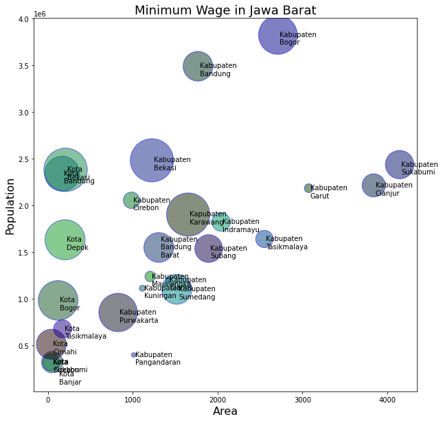
Gambar 1. Upah minimum kabupaten/kota untuk berbagai luas daerah dan populasinya.
Besarnya upah minimum kabupaten/kota diberikan dalam bentuk ukuran lingkaran sehingga dapat dilihat bahwa belum terlihat trend yang mengaitkan antara luas daerah (area), jumlah populasi (population), dan upah minimum (wage) dalam bentuk lingkaran-lingkaran pada Gambar 1.
notes#
- datavizpyr, “How To Make Bubble Plot in Python with Matplotlib?”, Data Viz with Python and R, 5 Feb 2020, url https://datavizpyr.com/make-bubble-plot-in-python-with-matplotlib/ [20220514].
- Rashida Nasrin Sucky, “Bubble Plots in Matplotlib”, Towards Data Science, 23 Jul 2020, url https://towardsdatascience.com/bubble-plots-in-matplotlib-3f0b3927d8f9 [20220514].
- , “How to Install Python Pandas on Windows and Linux?”, GeekforGeeks, 27 Feb 2020, url https://www.geeksforgeeks.org/how-to-install-python-pandas-on-windows-and-linux/ [20220514].
- Malgo, “Answer ‘Importing an ipynb file from another ipynb file?’”, Stack Overflow, 1 May 2020, url https://stackoverflow.com/a/52923466/9475509 [20220514].
- apaillarse, “Answer to ‘Label data when doing a scatter plot in python’”, Stack Overflow, 29 Dec 2016, url https://stackoverflow.com/a/41383476/9475509 [20220514].
- boblatouffe, “Answer to ‘Wrapping long y labels in matplotlib tight layout using setp’”, Stack Overflow, 22 Jun 2020, url https://stackoverflow.com/a/62521738/9475509 [20220514].